GeoD
A Geographical Visualization of Topic Models with WikificationDate: Jul 2019 - Jul 2020
Categories: Data Visualization, UI/UX Design
Categories: Data Visualization, UI/UX Design
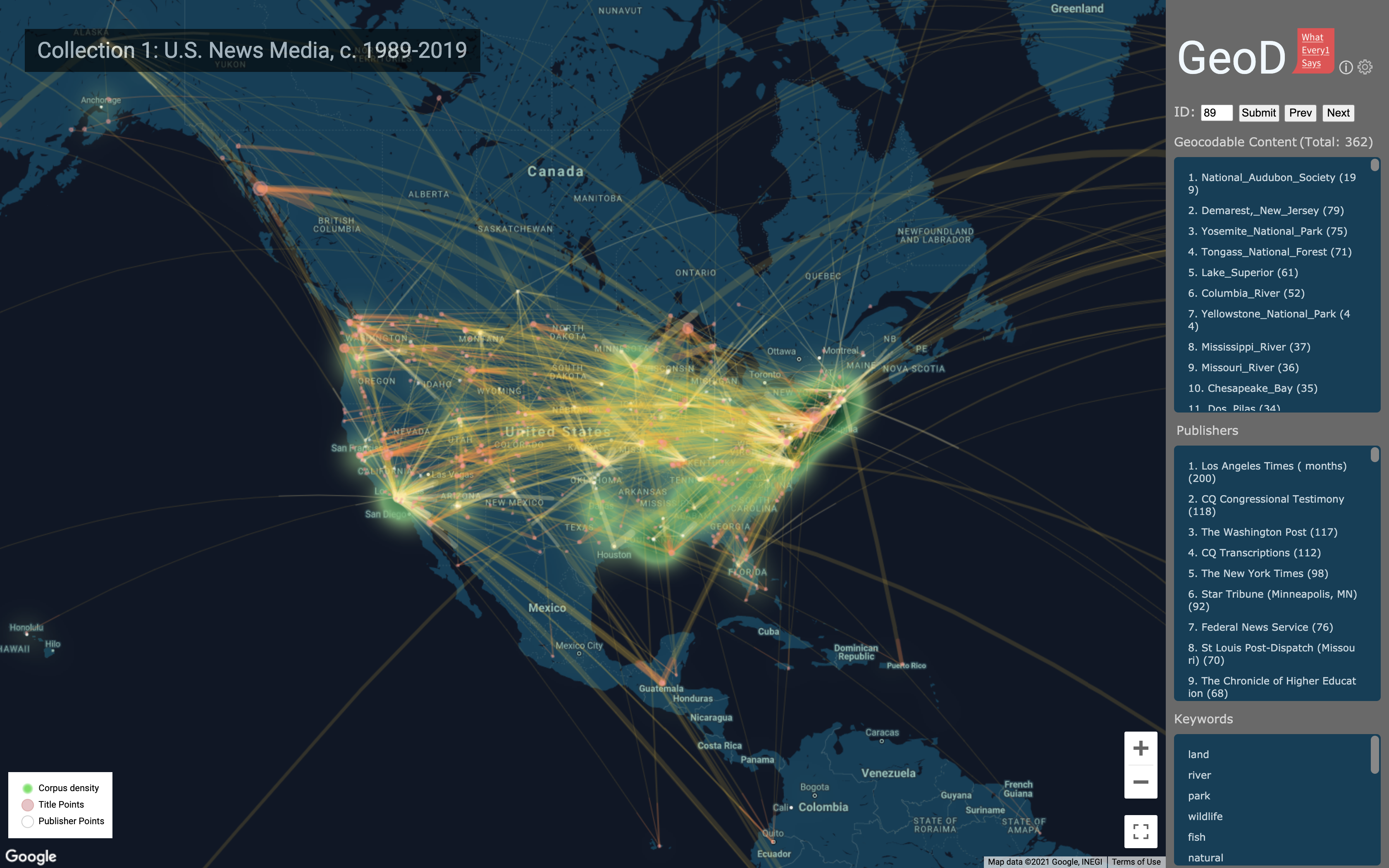
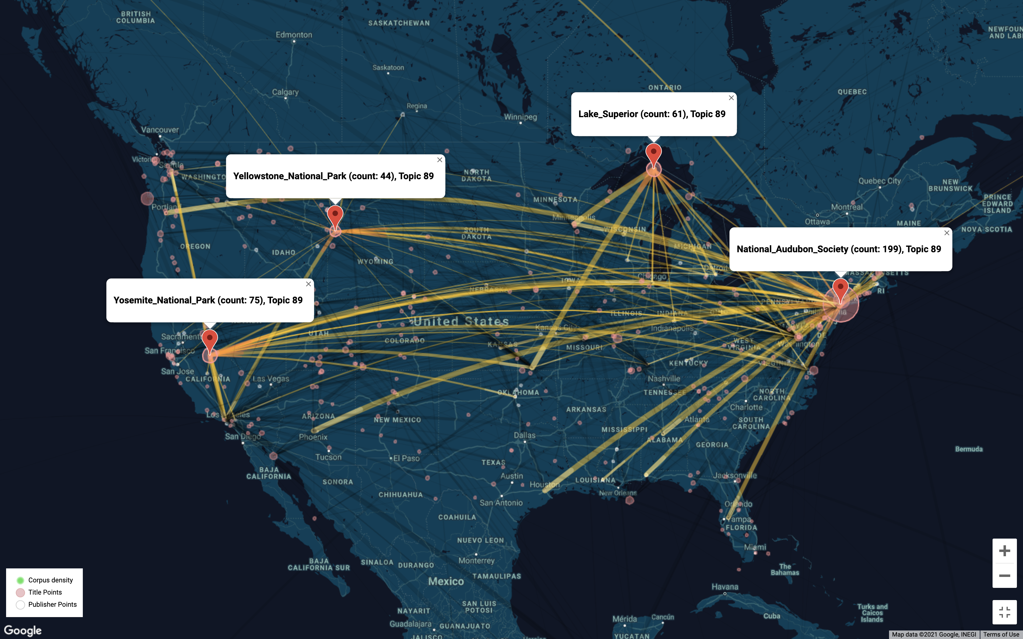
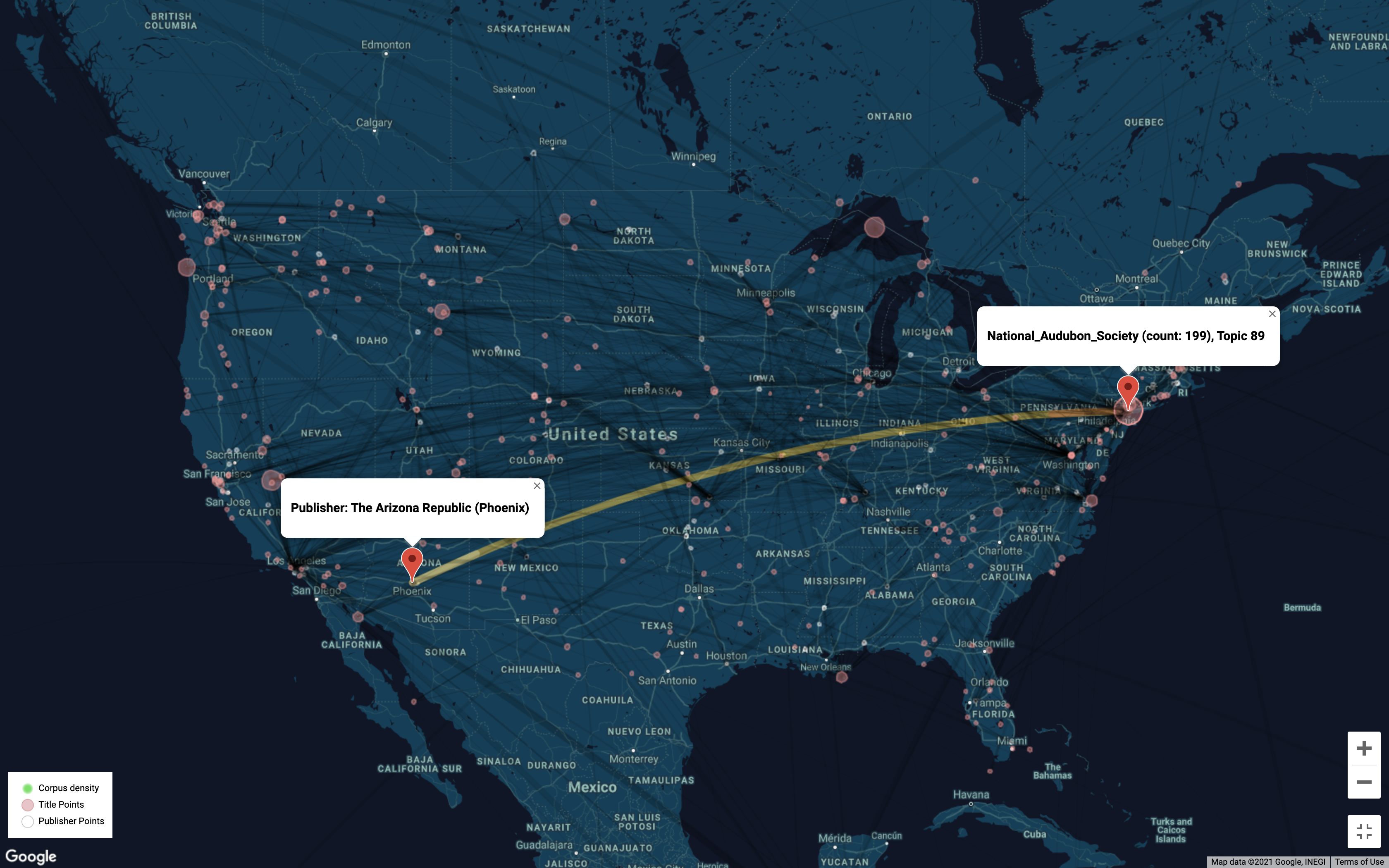
GeoD visualizes geographical information (locations and entities with geocoded information) contained in topic models. It can be used to analyze locations discussed in the whole corpus underlying a whole model or in a specific topic.
The geocoded information that GeoD maps is gathered from the corpus for a topic model first through a “wikification” process (using the Illinois Wikifier; see L. Ratinov et al., 2011) that confirms the recognition of named entities by checking for correspondence to locations, organizations, etc., for which there are articles in Wikipedia, and secondly through collecting latitude/longitude information for the data. (However, not all possible named entities can be recognized and geocoded as locations in this way.)
Please refer to the related article, Cultural life: Theory and empirical testing (Dan C.Baciu, 2020), for detail.
GeoD was created by WE1S Interpretation Lab, which is part of the WhatEvery1Says (WE1S) project where I worked as a Research Assistant with the role of Data Visualization Specialist.
Working example
Github repo
Credits
Created by the WE1S Interpretation Lab members:
- Dan C. Baciu: data science concept, design concept, supervision
- Sihwa Park: design and development lead, data visualization, interface design
- Xindy Kang: initial visualization, interface design
Visual Coding
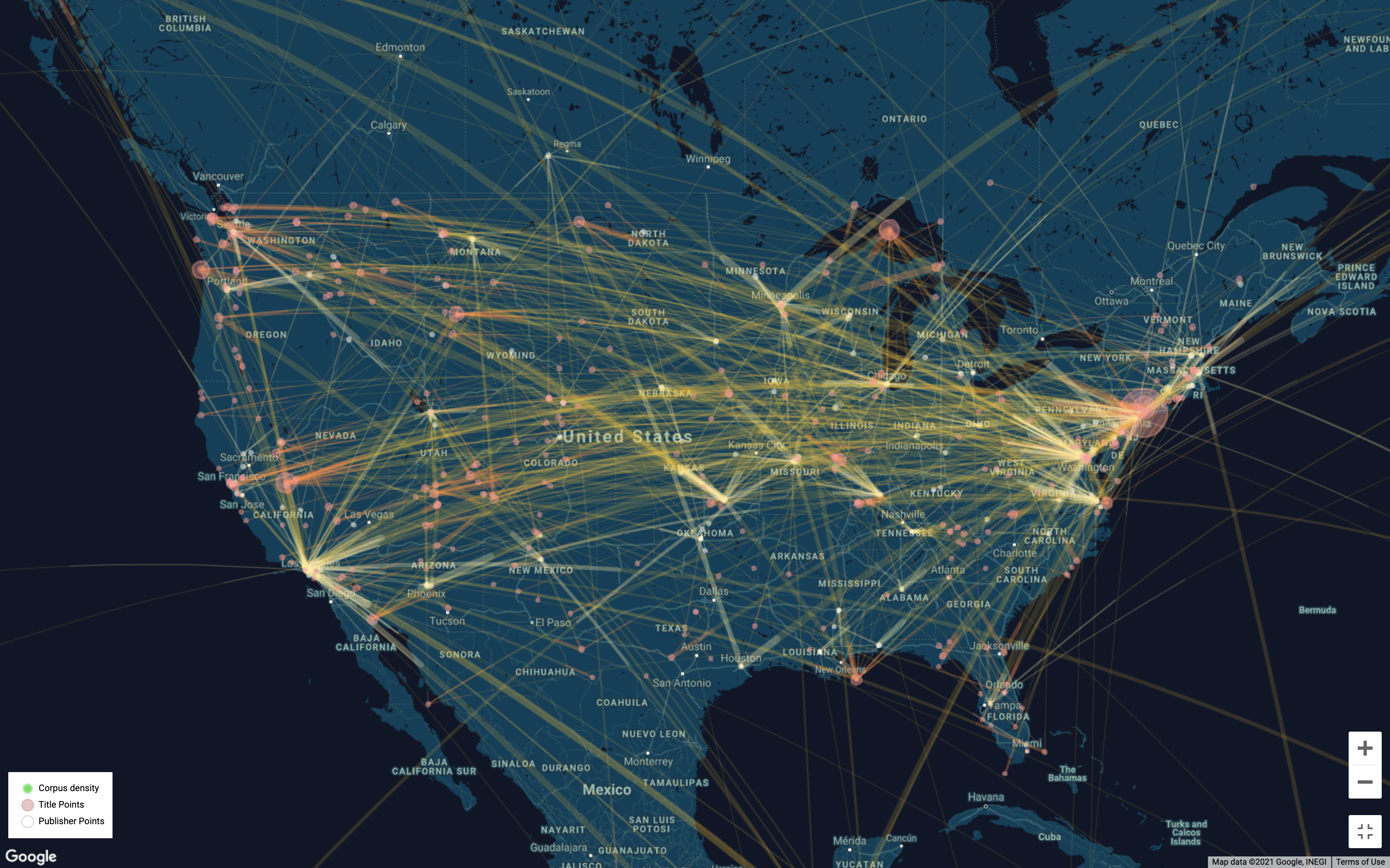
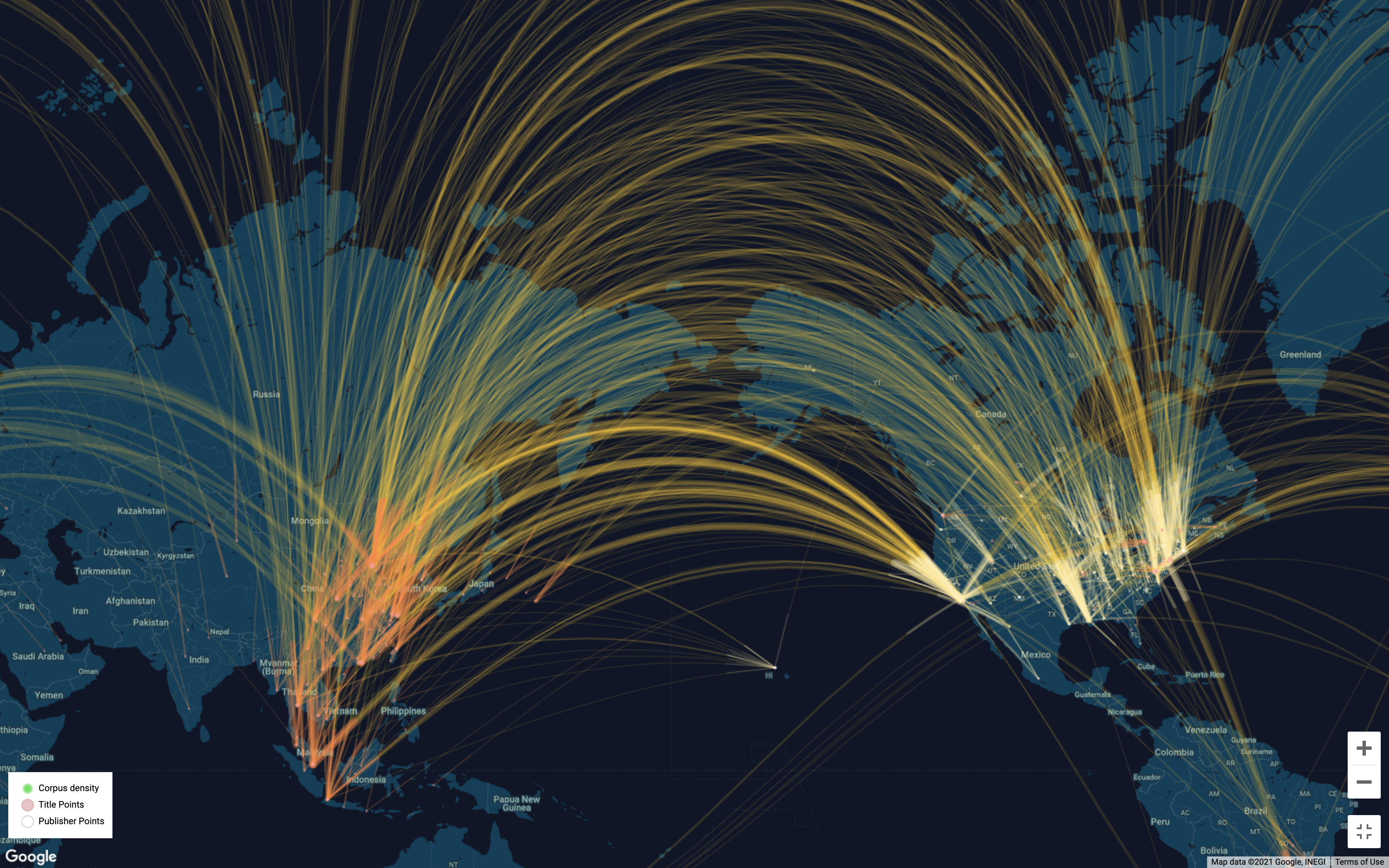
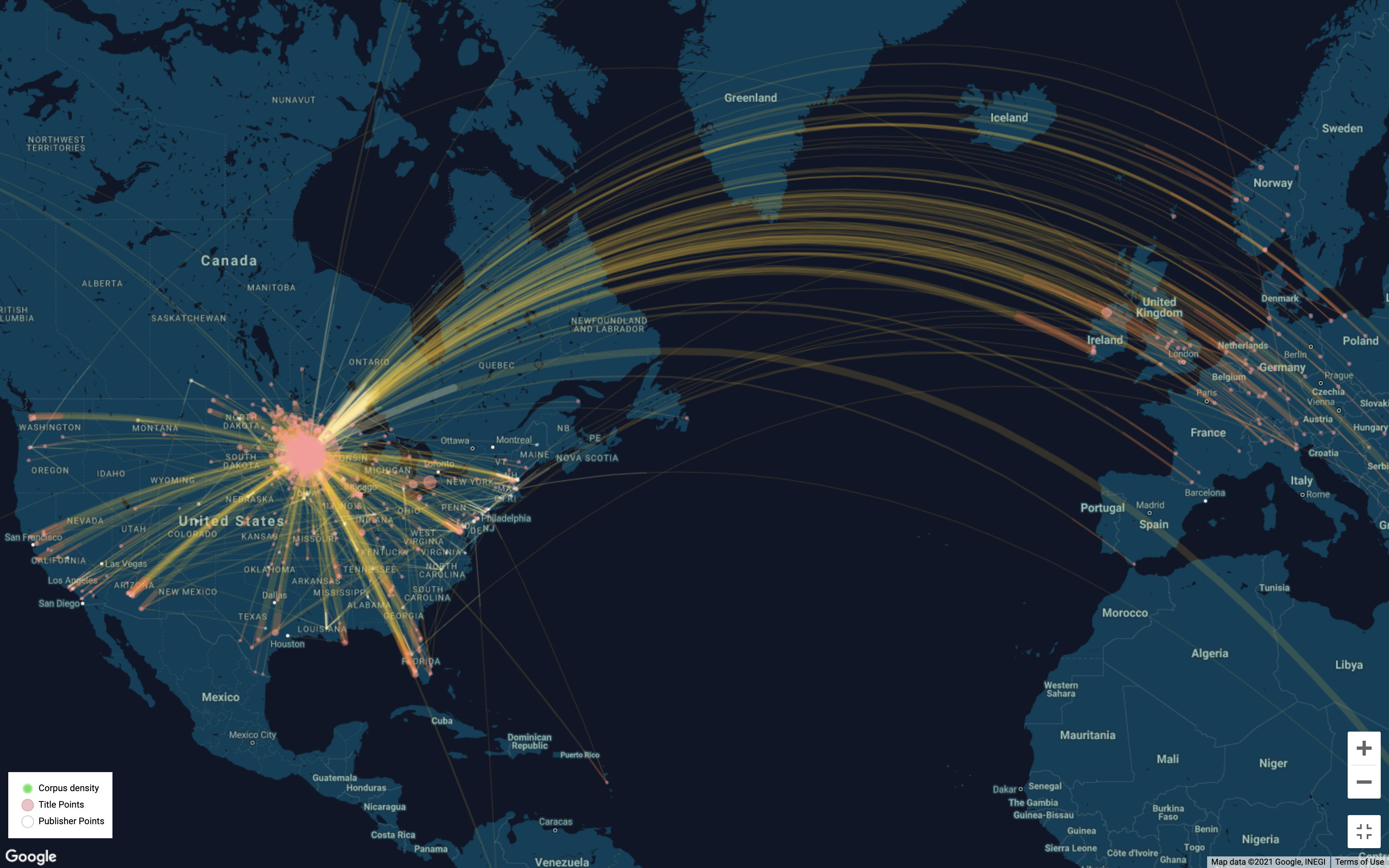
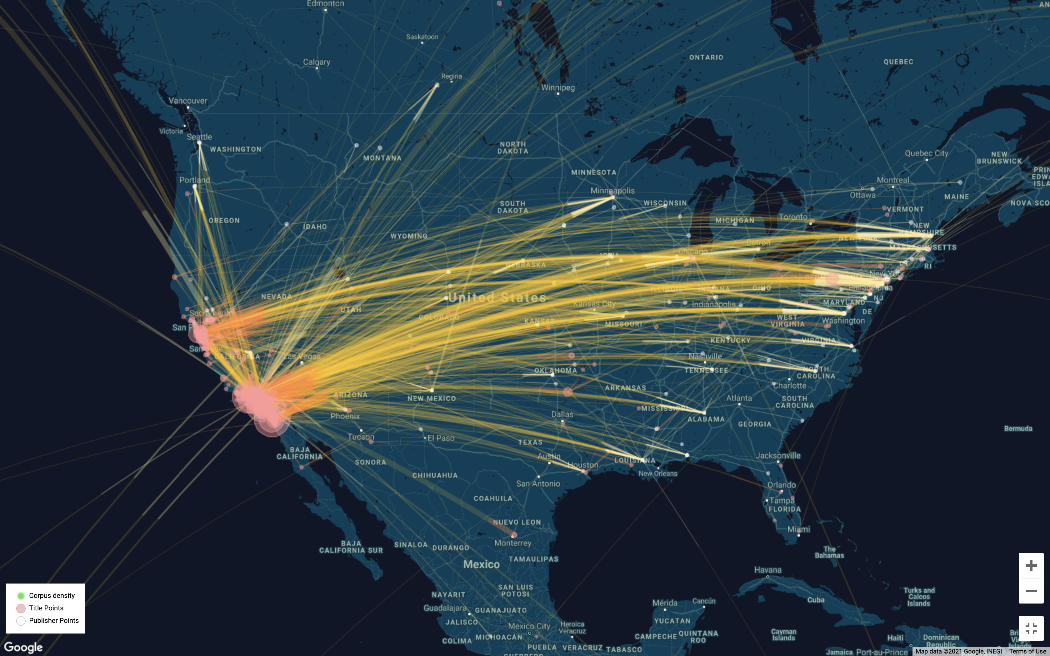
- White circles: publishers
- Pink circles: published news content
- Yellow lines connect publishers with the content that they published.
- Lines are tinted white towards publishers and red towards content.
- Green haze heatmap represents areas densely covered by news in this corpus.
Data
Among the WE1S data collections, the data for demonstration uses “Collection 1: U.S. News Media, c. 1989-2019”, which is the WE1S core collection of 82,324 unique articles mentioning “humanities”.
Various Views of a Topic

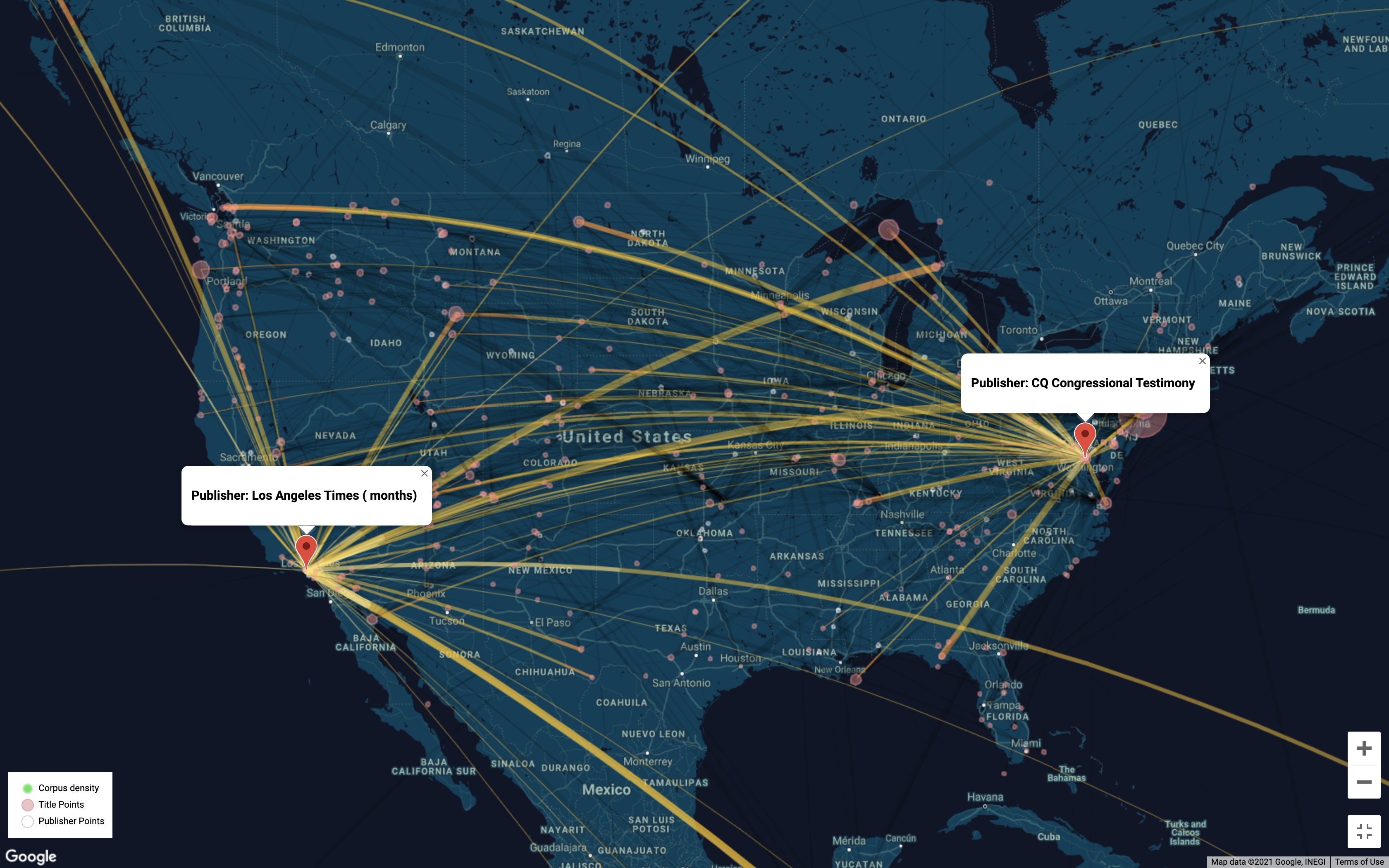
Topic-wise Comparison

Related Project
https://sihwapark.com/TopicBubbles